Lets Make Things — My Origin Story

General / 03 March 2022

In 2019 as I was joining a new studio I went through the exercise of writing an Origin story. It was fun and interesting to look back and think on the things that led me to where I was. Remembering that I had written that, I thought I should put it up here as well incase anyone who I may get to work with in the future would be interested in it. 

There is something utterly spectacular about the act of creating. Like all children I knew this intuitively, but I have come to truly appreciate it as I’ve lived, grown, and crafted my path. Like everyone, I’m a tapestry of ingredients, experiences, and interests. Among all of that, a keystone of who I am, a solid line through my life, is that very drive to create something.

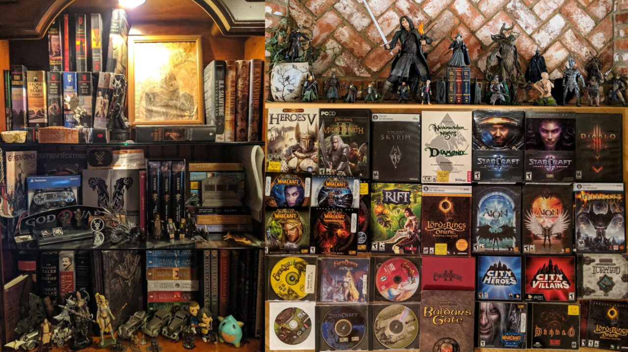
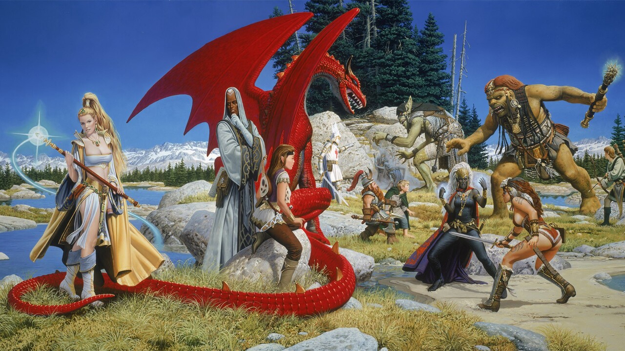
I grew up in Colorado, and have always had a deep love and appreciation for the natural world, and by extension the concept of setting. A place is much more than a location and holds so much; an invisible vessel. Just like how the concept of home is so much more vast than that of a building you inhabit. This, combined with an over active imagination, naturally led me to a strong appreciation of places beyond the horizon, and particularly for rich fantasy worlds. I love good Sci-Fi too, but for me there is something special about fantasy, though I know it comes in many forms and flavors and often less well formed than we’d like.

As a kid I grew up watching my older brother play games — and that has forever imbued some level of socialization into my concept of gaming. The inside jokes, the laughs, and everything else was shared — even silently. Gaming is a door to a huge and ever expanding array of awesome experiences, but the ones I enjoy the best are ones shared with others.

Beyond watching my brother play Final Fantasy, gaming for me really started with MMOs — which were just then emerging (if you don’t count MUDs). I started with Ultimate Online and then Everquest, then on from there over the years. These games naturally scratched multiple itches for me — gaming with social interaction, a love of fantasy, and a desire to explore alternate realities. The days of having enough time to play something like that have long been gone for me, but my nostalgia for the genre is very strong.

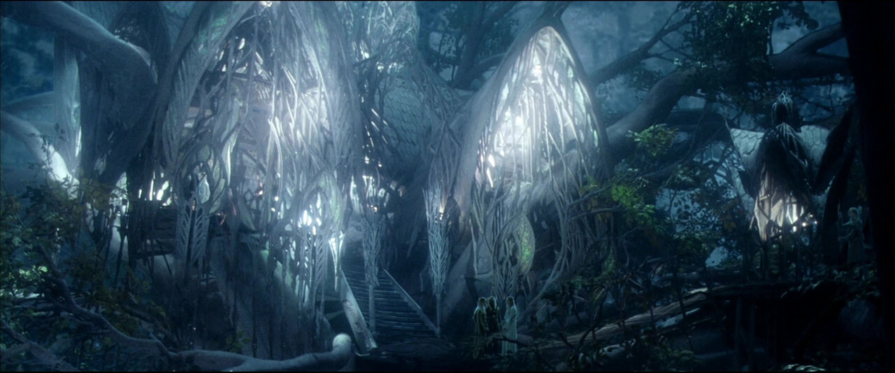
Beneath the uncertainty of youth was an ever-present but unfocused feeling that I’d go into a line of work that allowed me to express and grow that love of creating, of doing things together, and of worlds you could never otherwise touch. That image was murky for me at first, but came into focus when I watched the appendices (behind the scenes) of The Lord of the Rings, starting with the Fellowship.

I got to follow the epic journey undertaken by all of these scrappy, talented, and tenacious people who crafted the films. I learned about the excellent work they did, and experienced the story of how they all did it together. It spoke to me profoundly. It was a watchable example of what I wanted all along, but couldn’t previously put words to.

It wasn’t the medium of film specifically that hooked me, nor that of gaming despite great love for both. It was the idea of creating side by side with amazing people, and the stories we’d have to tell when all was said and done. Watching their journey was when my future came into clear focus.

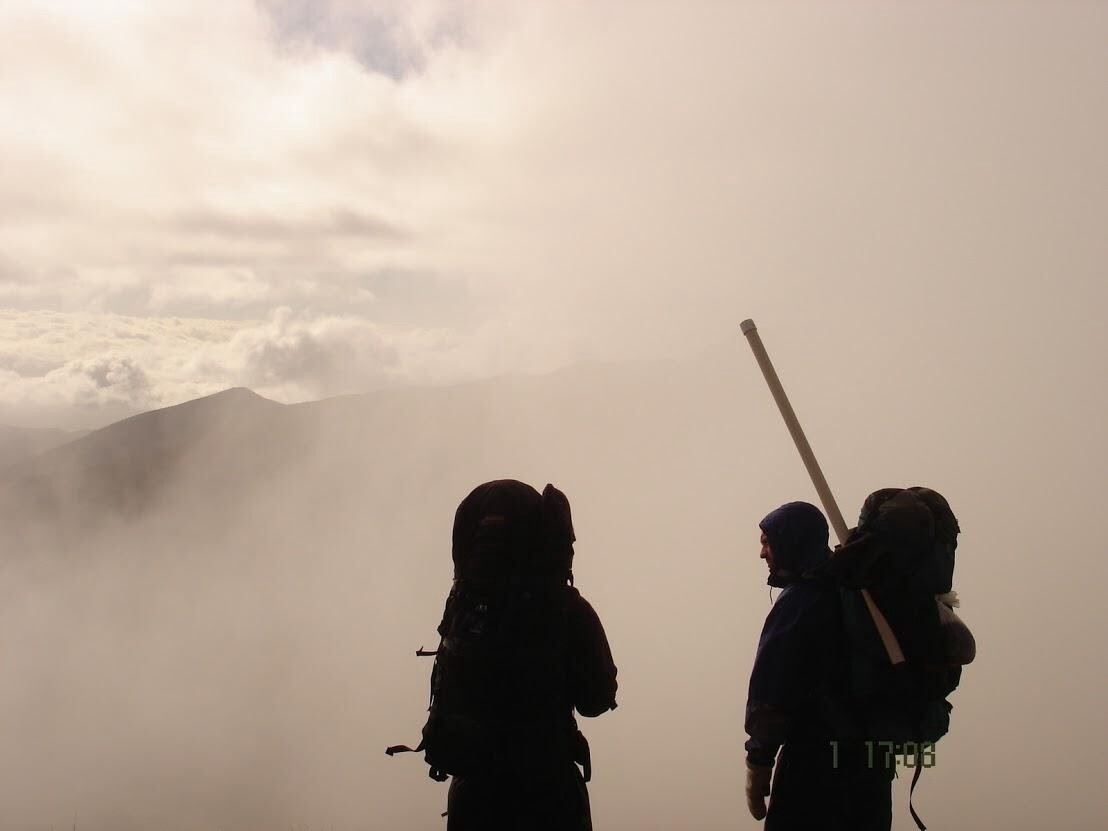
So, after a backpacking adventure to New Zealand, I dove in to an art education. Initially I started at the Art Institute of Colorado, but I met someone who eventually persuaded me to check out Ringling College — famous for computer animation.

I’m grateful he did, because it is where I met the love of my life, with whom I now have two amazing children. Ringling’s value for me, above anything else, was an environment of hard working, passionate young people.

I studied Animation, without knowing then if I wanted to go into film or gaming — but wanting to be capable of both. In the end I had some opportunities to go to Pixar or Dreamworks (which is really what that major is geared for), but ultimately I felt called towards the interactive worlds only possible in gaming. I felt then what I know now; gaming is the best place to create experiences and worlds to explore, and share them with others. Though the reality is that there are lots of limitations, it feels potentially limitless. This is especially true as I look into the future, which I think is bright and exciting for our growing medium.

In the Computer Animation major our thesis is an animated short film we produce entirely on our own (or sometimes with a small team). I went less in the route of a true short with beginning, middle, and end. Instead I wanted to just open a window to a fantasy setting, and if being honest, just make cool stuff. By then my proclivity for modeling and texturing was clear — that’s what I enjoyed the most, despite having a huge respect for the craft of animation. I had been teaching myself more about game art on the side, and while the short is all pre-rendered, everything was made as if it were game art — simple low poly models with normal maps, which I don’t think anyone else in the major was doing at the time. I wanted to practice the techniques for the industry I was more interested in, despite not having to use those methods. It's pretty cringy to watch now of course, but I was proud of what I did with what I had and where I was at the time.

A shot from my old student thesis short.

In the gaming industry I found what I was looking for and craving since my path became more clear. I believe that this is one of the most challenging, engaging, ever shifting, fascinating lines of work one could be a part of. The opportunities are vast and ever expanding, as are the challenges — both intellectual and technical. It can be a really stimulating space to be in — and I’m proud to work among the amazing people that make it what it is.

I wanted to start in smaller studios as I think they necessitate greater and faster learning. I worked at Armature and Illfonic a bit before finding myself at Santa Monica Studio to craft the new God of War. I loved everything we accomplished there, and everything we built. Deciding to leave was quite difficult, but the desire to help build something new and to explore more of my multifaceted art production interests led me to the fantastic team at Bonfire and onward, allowing me to meet and be inspired further by lots of great people. 

It may sound tacky, but I'll always be attracted to companies and teams that truly value the bonds we form as people doing this work together as much or more than the work itself. The future of our industry is bright and full of possibility. I think it's important to be invigorated and excited in this line of work, and maintaining that outlook has a lot to do with who you do it with. Who knows... maybe someday we'll make something together!

The Road goes ever on and on,
Down from the door where it began.
Now far ahead the Road has gone,
And I must follow, if I can,
Pursuing it with eager feet,
Until it joins some larger way
Where many paths and errands meet.
And whither then? I cannot say.

~J.R.R Tolkien

Why aren't you using Virtual desktops?!

General / 25 March 2022

Hello friends! I wanted to bring to your attention some things you might just come to enjoy making good use of, if you are not already. This applies to Windows users, sorry Mac people!

Whether you have one monitor or a bunch, it ultimately ends up being a static space that fills up fast. We're used to it, but is it great? Could it be better? The answer is...

Yes it can. 

In this post I'm going to draw your attention to a default feature of Windows that it seems few people known about, and a free tool which gives you options to make your window shuffling/juggling life a bit more sane and customizable. Both of which are all the more powerful on wide format monitors and when combined with virtual desktops. 

Since adopting and adapting to things mentioned below, I've had a much better time at the PC and can not imagine going back.

So to start off lets talk about what a Virtual Desktop is, and why you might consider editing your day to day workflows to incorporate them. A Virtual Desktop is basically just a blank slate version of what you're used to in windows as your desktop, but in this way it allows you to spread out or group things in their own organized spaces instead of scattered and piled all on one. The best analogy is a physical one; imagine you are sitting at a real physical desk and the surface is covered with documents you'll need to file your taxes when you finally stop procrastinating, your half eaten lunch, a book you were reading, your distracting phone, and somewhere in the midst of all of this the work you're trying to focus on. I think its fair to say that some amount of this is true for most of us just abstracted into the digital desktop space of our monitors (then further complicated by our actual physical desks). With that Analogy in place, imagine you had unlimited desks that you could switch into at the press of a button, and could dedicate the full space of that desk to whatever task or distraction you might want, rather than having them be all overlaying and begging for your attention. 

It is known that clean and open spaces lead to clearer minds and therefore increased focus and creativity, and it is also known we live in an attention economy where everything is competing constantly for our interest - especially digitally in the limited dimensions of our varied screens. That only likely multiplies with home related things in WFH situations. We're not going to solve that today, but we can find ways to give ourselves help within that landscape. For that reason alone, utilizing virtual desktops can be a huge help in that it allows you to tailor your focus and shovel away distracting things into their own space and out of your productive ones (since outright removing them isn't realistic or desirable for most of us). Its a have your cake and eat it to scenario for software presentation, put another way. By this I mean it doesn't have to be binary on or off or covered up/buried, to be available and yet doesn't need to be in your face when you don't want it to be (or even probably shouldn't have it be). 

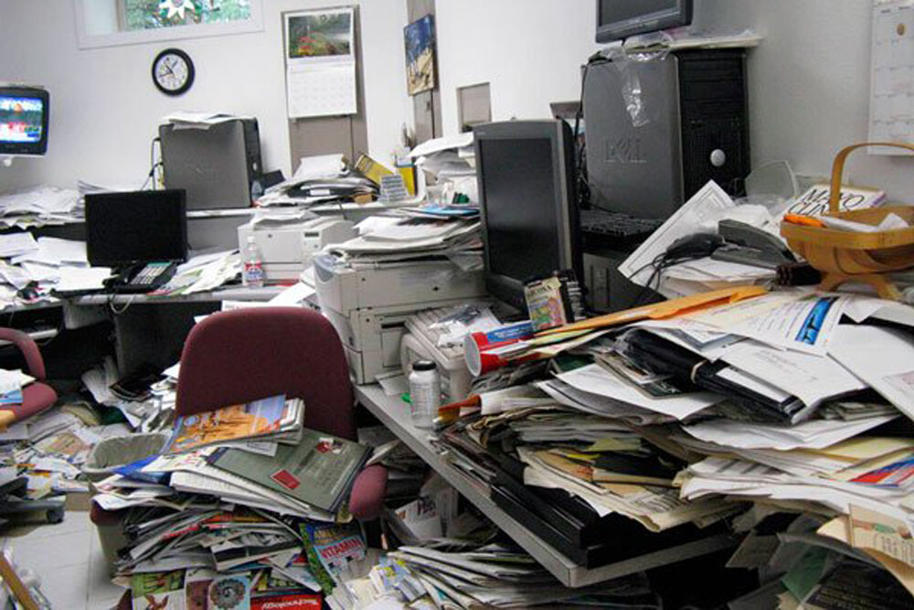
Which of these quickly googled images below makes you feel like you'd be able to sit there and enjoy getting something done?

Yes, these are physical desks and not screens - but again the analogy is helpful because in our mix of open programs and 83 internet browser tabs and so on its easy to end up having something like the first image practically and mentally. What virtual desktops can allow is still having all of that stuff on your desk, but separating it out and presenting it to yourself across numerous desks, of which you see just one at a time, since you probably only need one or two of those related things at any given moment. I'll get off this sandbox here, but hope that helps illustrate one concept that can become powerful when you tailor it to your own use cases. 

Beyond that general concept, re-gaining total screen real estate built around a specific type of task or program is quite powerful, even if you have a relative ton of screen real estate. Shoved all into one desktop space you'll want your internet browser up so you can easily get to it, and its frustrating when it or something else covers it up - which will continually happen in the juggling act. Same goes for fill-in-the-blank numerous things. Further, browser tabs take your brain out of what its doing to search and dig around - but having a few instances of a browser open across different desktops that are dedicated to what may be going on in that space reduces significantly mental hitches between things. Staying on the topic of browsers; the net is addictive. One of the perks and also one of the drawbacks of a desk based job is constant access to the web. So, how do we manage that effectively and use the good sides of that and hopefully minimize the distractive power it easily wields over us? I've personally found that having a separate desktop which I dedicate to email, text, and other related things - anything that would be a moment to moment distraction at the corner of my eye, has boosted my ability to focus greatly. I can be at it in one second, so its not inconvenient, but it's also "off the desk" unless I choose to look at it in that moment. 

There appears to be no real cost to virtual desktops themselves from your computer's perspective, apart from whether you are running duplicates of programs across each of them (which is just the same as opening multiple instances normally). So to clarify, its still just windows and what apps are open, only its a way of organizing and grouping whatever you have open and is effective as each desktop doesn't have a sense of what is open in others meaning it presents as a blank slate, or an empty desk if you will. The uses are obviously as customizable as you prefer to work - I seem to be just fine with about 3 or 4 virtual desktops in my general use so far but would just add ones if I felt the need or desire to. The amount you can have is far larger than anyone would reasonably ever make use of. 

You can easily find information by just searching "Virtual Desktops" but as a quick primer all you really need to know is that Win+Tab will open up the desktop view where you can see your various desktops, move windows between them if you wanted to shift something from one to another, name them, close them out, switch between them, etc. However, I just use Ctrl+Win+arrow keys to slide between desktops, and you can make a new one with Ctrl+Win+D. Notably in the Win+Tab view you get a version of this on each monitor you have so you can drag a window that's open in your current desktop to either the same monitor or different monitor on another desktop, should you find the need to do so. For me this only really happens if I start opening a program that takes a while to start but switch desktops while waiting and it appears in one I didn't intend, or if I had a YouTube video on for example in a desktop space I was working in and wanted to bring it over to one I was going to be spending my time in next. 

Alright, so with that in mind lets talk about Fancy Zones. You might like Fancy Zones even if you don't make use of virtual desktops (but c'mon... you should), especially if you have a wide format or odd format monitor. Personally, I use a 49 inch wide monitor as my main with two more standard monitors above it. At least, that's the setup now until I swap those two out for another 49 inch above. :P

Fancy zones is one of the utilities that comes with the free official suite of tools called Power Toys. There are some other handy things in that suite, but I'll keep this focused on Fancy Zones. Think of windows default snapping behavior but better and giving you control over layouts that you can quickly snap a window to. Also, this doesn't overwrite windows' default snapping unless you want it to (I don't), so you can use both in any scenario. As of a recent update, this includes child windows of other software making it all the more powerful. So essentially, make profiles of different kinds of window snapping configurations you want and assign them per screen.  A few quick examples of why that might be nice:

  • You have a wide format monitor but just 50% split left and right kind of suck because what you really want is your eyes in the center but manually scaling windows over and over is a major drag. So make a profile with a nice big space in the center and two wings (or divide those up per use case into 4 smaller zones like I do for example).
  • You want to have multiple file browser windows opened to some commonly used areas without getting lost in what is where or having to re-open it yet again. Make a grid of however many (I have a profile that splits a standard monitor into 4 quadrants) and have 4 folders up in there, making it easy to grab things from various places or move between various places without pulling you out of flow to go find it (even if it was an already open window....we all know how that goes). 
  • Working in a software, I'll use Unreal as an example, and you want a nice column of space to snap content browsers to but other sections with different parameters that you can put other windows in so that ultimately the whole main section of screen is just viewport but you still have access to all the jazz. 
  • You can make a pretty minimal zone for something like a work email client so you can see if a new message has arrived then just clicking on it and pressing Win+UpArrow will maximize the window so you can deal with it if you want then press Win+DownArrow to return it to its minimized view in your layout. Same with other stuff. 
  • Plenty of other scenarios. The world is your oyster or whatever.

This becomes even better when combined with virtual desktops, because each of those will retain its own settings individually (per desktop and per screen in each desktop). So that allows you to have as many spaces as you want that are tailored to the experience you want to have or the things you want to do in that specific desktop space, while retaining super easy access to all of the others. This does wonders to help you focus, while also greatly multiplying the amount of effective screen space you have. 

You can have more things open and easily accessible without the digging and finding while simultaneously not having any of the currently not relevant stuff be a distraction in any way. 

Hhhhoookay, so. Download Power Toys and play around with Fancy Zones (Tip - set the space around zones to 0... which I wish was default). Then start making some virtual desktops and play around with switching between them with Ctrl+Win+Arrow Keys. Just start with one extra to switch between and see what that does for you, and I'm sure you'll take it from there!


Huge Heap of Hopefully Helpful Hints

Article / 01 September 2018

Soon I'll be returning to my alma mater Ringling College as a guest to speak to and with students as well as, hopefully, provide some useful critique for their theses. In advance of that, I thought I'd put down thoughts in one place that I can refer students too, rather than hoping I remember to say even half of it, and also to open up what time I have for answering questions rather than being a talking head.

In addition to that, I've received a decent amount of questions and requests for advice - and while I'm very glad to be of any potential help to someone, I've often not been able to answer everyone or spend the time I would wish to when doing so. Life is very busy for me currently and only going to become more so soon with the arrival of my second child. 

Since much of my advice, such as it is, tends to take a fairly general form - having a place where I've written some of this out will also provide a way for me to try to be helpful to someone in the future even though I may not be able to get back to them with enough time to really provide value or get very specific, I could refer them to this post. 

Below is an attempt to gather answers I've given when asked by people with the goal of becoming a production artist. 

Disclaimer

I am very happy if I can provide some insight or idea that can be helpful to you or a person you know who might find this interesting. However I in no way pretend to be an authority on anything or say that you should be listening to my advice. I feel honored to have been asked when I am, and certainly hope that anything I've said can be or has been helpful. However, like anything - it is simply an expression of my own experience and thoughts. I leave it to you to determine if it is useful or not, and encourage you now and always to engage your own critical thinking. 


If you are saying "Wow... TLDR", that's fine. If its not relevant to you then close the page. For those who it might be of help, perhaps its worth some time to read and consider. You are already spending years and likely lots of money, 20 minutes should be fine? 

I'll front load this with the bulk of information I'm bringing to this post, as it is the thing aspiring artists are most concerned about. That, of course, is Portobellos. Uh, I mean...

Portfolios

One of the most common questions people starting out have usually involves their portfolio, which makes sense - it is after all the bridge between you and where you want to go. After a little time in the industry or being involved in a hiring process for someone else - certain things become very clear that just aren't for most until that happens. Below, I have some specific suggestions that I hope will be helpful.

The first and best piece of advice I can give is something I've suggested to several people who have brought portfolio questions to me, and it is a mental exercise that can reveal a lot more and serve you better and longer than a bullet point list of do's and don'ts (also included). Flipping roles can be more illuminating than anything else. This will always be relevant regardless of how things may change over time. Set aside some time and pretend you are no longer someone applying for a job - rather, you have started a studio to work on <insert some ideal project to you here>, and it is your job to hire people for the role or type of position that, outside of this exercise, you want. 

Okay, with that in mind - give yourself one hour to review 30 different people's work on Artstation that relate to that job somehow. Filter by a tag related to your desired role (concept art, character/environment art, vfx, etc.) Here is the key, take mental and/or physical notes on what goes through your mind when you truly do things from this perspective, play the role as best you can, try not to fall back into your own way of seeing it. 

You will quickly notice an impulse to skip to the next person or stay on them for a moment based off of only one or two pieces. After seeing one thing you'll consider that X person isn't yet up to a level you'd want, and you probably wont look over much of their other work. You'll also notice that certain things pull you in, and make you want to look at another piece of their work. Think about how many pieces it takes for you to decide you'd want to reach out to this person, and how many it takes for you to decide to move to the next. This may vary by person, but if I said 10-20 or 1-5, which do you think is closer? Doing this will answer that for you. Armed with these observations, and I really recommend writing them out to force your mind to intellectualize them and solidify them, have an honest look over the work you have right now and notice which things you think fall into either of these categories. As someone starting out, this might be a frustrating process - but you must bear in mind the goal, which is of course to both improve as an artist and to give you insight into what goes on in the minds on the other side of the table, helping you make steps to get to where you want to go. You may not/likely wont feel super confident for a while, and if you do, then its time for you to stretch your comfort zones. This isn't about making you feel proud of your work, its about helping you to get a job, the job that you've likely been doing all that work to get in the first place. 

If you feel a bit discouraged, that is natural - all of this is a journey of doing and becoming, and we simply get better the more we do things as human beings. Talent and hard work do a whole lot, but time spent is also highly important and its just something that someone starting out will naturally only have accumulated a certain amount of.  With this hopefully more objective look at your own work, you can then make decisions about how to organize, display, re-display, or what new things perhaps you should focus your time on creating to give yourself the best chance of not being looked over. People who examine candidates tend to know quite quickly where people are at with their art and can routinely identify student work, which doesn't mean you wouldn't be considered, but does modify the thinking.

Okay with that long but I believe most important piece of advice out of the way, here are a few specifics for your consideration in the more usual do/don't format. 

  • Consider and/or design your hook.

    • As you will learn from the above, its important to know that you really only have a handful of seconds to grab someone's attention and keep them from moving on - which is the start of everything. If you did what I talk about above and were anywhere close to examining 30 people in an hour, that's an average of two minutes per person. Now imagine that more than half of that time was spent inputting URLs and navigating to and figuring out different people's sites, instead of simply pressing next on Artstation. Consider in presentation something that grabs the eye or makes someone want to see the rest of your images. Be careful of over complication - provide a strong initial image with a definitive focal point
    • Follow that up with supporting media that answers questions you would have if you were hiring yourself. Put yourself in the shoes of a busy person who has seen a lot. Surprise and answer that person's questions as best and simply as you can. 
    • For a given piece of art composed of different pieces, when you've made everything the natural desire is to show/highlight it all - but this can often be a mistake. You'll want to consider how things harmonize and the way you light things to really create a true sense of space/personality, etc. This is an ingredient for something that people want to look at longer.  You must allow things to melt away, to provide (like any good composition) a focal point, and things that lead the eye - to have some things be in shadow despite wanting to show them off. Its important to think of the thing as a whole, instead of a supermarket of 3D assets - as what we'll want to see is not just that you've made decent technical art, but that you understand how to make a place or character feel truly there, that you can reach through the screen, grab someone's brain, and put it in your world. This doesn't have to mean it looks "realistic" - any given style can feel grounded within its identity. You can always include an image or two that more idealistically showcases  your various assets - but have one where that isn't happening on all things at all times and let us see that, then explore the rest. 
  • Remove all possible barriers to viewing and understanding your content.

    • Do not presume people will look at all of your work. Put your best foot forward without any obstruction, in the easiest format possible to view your work. Things change, but in our modern times on the internet that means scrolling versus pages. Make it as easy and quick as possible to view and understand your work. Do not gate things behind different pages or unnecessary category systems
  • Show off your work cleanly - anticipate and answer questions concisely.

    • Artists will form fairly instantaneous opinions on work they see in two categories; demonstration of artistry/appeal and technical competency. There are various ways that are unique to each person that they may want to focus their portfolios around - but examples that cleanly and succinctly display both of these things have the highest chance of getting you looked at and considered for the roles you may be striving for. 
    • For 3D artists of all categories and disciplines, people typically want to see how you have solved topology for a given thing if you are still inexperienced; were you wasteful or does everything in there come across in a meaningful way? If applicable, does it have the proper flow for animation? We want to see a quick example of how the various technicalities involved in making this sort of art were approached to achieve your result - especially for people with less experience. This might mean one or two images, not 5-10. 
    • Viewer files/sketch fab, video turnarounds... these things are great IF people want to explore deeper, but don't expect that they will - remember the time issue. 
    • If you flip the tables and were hiring yourself, what would you want to see to give you some confidence that you are hiring someone who will do a good job?
  • Start with 3 strong portfolio pieces. 

    • You don't need 10 or 20, most people will decide off of just two things. One to interest someone, and another one or two to confirm that it wasn't a fluke. Skipping quickly is not something that is cruel - its just a reality that time is valuable and you don't have long to get someone to say "Woah, hey - cool. What else do they have...?" That's where it all begins - but many students because they have only certain amounts of work will tend to show all of it, assembling a buffet when really what people want is a nicely plated single meal, maybe with some desert if they feel up to it.
  • You don't have to and often shouldn't show everything.

    • If it isn't answering a question or showing something important that you feel you've done very well, consider removing it. It is common of student portfolios to provide detailed looks at all sorts of things. There are times where this is great, but much of the time it creates bloat that doesn't help much. In these cases it can be a turn off. For example, if you aren't quite proud of the topology or trying to show how efficient and clean it was, why show it? We don't usually want to see some breakdown of the textures related to a mesh (always exceptions of course, but this doesn't really get you much.)


Alright, if you are still conscious its time to take a break. We just crammed a bunch of information in your brain's mouth, give it some time to settle in your brain's stomach and start digesting. That way your brain's hands (which, unlike the bits in this stupid metaphor, are your actual hands) can put them to use later. Come back when you're fresh and have some mental space, this will still be here.


General Things to Consider


  • You are a person who works with people, more than an artist working with <job title>.

    • People naturally tend to focus on the skills that relate directly to their craft, but miss consideration of interpersonal and communication skills which can block or unlock lots of potential. I would advise giving some thought and time towards developing these "soft skills" (how they are known in the professional world) as much if not more than the rest. They can either serve or harm your career as much as anything else, and are essentially never brought up. Despite caring about this a lot, I personally struggle in this area from time to time in certain regards (I believe almost everyone does, in degrees). I think I’ve identified some reasons why that occurs and can then try to modify habits. Be cognizant of your own areas that need improvement, and strive to improve in those. This work is never done, its a lifelong thing.
    • Read the beautiful book "How to Win Friends and Influence People" - somewhat of a convoluted title, but its all about human interaction and relationships, containing what is really so obvious yet so seldom really applied. Despite knowing these things, I still fail at them routinely. 
    • Spend quiet moments with yourself, away from the incessant modern distractions, where you find important answers to difficult yet simple questions that matter. Why am I doing this? What do I really want from my craft? if I am going to do this am I willing to be the best I can be? Find your answers, then just get to work.
  • Relax!

    • Its normal to be nervous at an interview or through your first week or two. While we can't always completely control that, its important to not try to project some image that you think you should have. People work with people, and the more at ease/natural to yourself you are, the more it puts others at ease - and good things grow out of that. 
    • While I do this well with most, I personally have found i'm overly shy around people I'm answerable to. That's an area I need to work on, what are your's? Be sure you can see the forest through the trees as best you can, and remember to put effort into growing as a person as well as an artist. Those things should feed each other, not consume each other. 
  • Be patient and diligent.

    • Your first job doesn't always need to be exactly where you want to be - your "dream studio". Its normal, natural, and a good thing to have a variety of different experiences and to move around. People through the whole industry have or will at some point jump around to various places. Wherever you go, whatever you do, you'll learn something - and that something will no doubt be useful to you in some way. Remember, as artists - we don't just make models and materials, paintings and pixels - we conjure worlds! I'd say its very useful to be worldly, to know lots of things that might seem random or un-related. Everything is related, everything is relevant, and as artists we need to pull from things in our lives to enhance our art.
  • Do lots of doing.

    • Tutorials are great for introducing concepts or helping you when you feel you hit a wall, otherwise - just open up programs and go make things. Be messy, don't be too precious with things - we have every lever of iterative power; tons of undos, iterative saves, duplicated meshes that you can experiment with then delete. Use these, there is tons of stuff to discover if you just get in and allow yourself to go a little bit mad scientist. Doesn't mean you keep the art, but you will keep the "Woah, if I combine this and then do this to that then bend that around this and do this kind of thing.... that's super interesting." observations that become tools for you. This is tremendously helpful because what do we make as 3D artists? The first answer in your mind is likely some specific genre of 3D based on job title - but the real answer is Anything. We can, and likely will, make anything and everything. Its good to have some back pocket ideas and confidence that you can find a way to do just about anything. 
    • As you go about doing certain things you'll encounter issues and rather than stopping, you'll seek answers and develop techniques. You'll experiment with ways to alleviate, circumvent, or improve those issues. THIS is a major way you learn valuable things.
    • Reference and inspiration are great, valuable, important things. However, be sure to be able to turn it all off and pack it all away. Turn off that second monitor, shut off your phone or put it in another room for a while - open up the mental space for things to happen. Remove distractions so you can chase lightning when it strikes. 
  • Be willing or even excited to step beyond your comfort zones.

    • Most of us get into whatever industry we are in because we are driven by or towards a certain thing. That's wonderful, hold on tight to that and feed it forever. However, don't have blinders on to anything that isn't directly that, expand your horizons and understandings of everything around it, and also within it. 
  • Be humble, open minded, and willing/excited to push further.

    • Never take critique as something personal (even though it seems so because we attach ourselves to our art) - true critique is honest and in the spirit of being helpful/insightful/or challenging to reach something possibly better even if what is there is already good. When done well it comes across and is received this way.


  Maximum character limit reached.

The Rookies 2018 Winners Announced

General / 16 July 2018

I was honored to be a finalist judge for The Rookies this year, which was something I was completely unaware of until I was approached about it. Looking over the work coming out of students and others in various situations and timelines in their artistic careers is somewhat re-invigorating. I wish I had some of the tools available today when I was at the same point, but regardless of things that change what stays constant is the passion people have for art and their craft, whatever it may be. Congrats to the winners, selecting top picks was a pretty arduous task. 

To all that make art... keep creating!

Have a look at the 2018 winners, and of course all the other excellent entrants too.

God Of War Art Blast, Musings, and Thanks

General / 21 June 2018

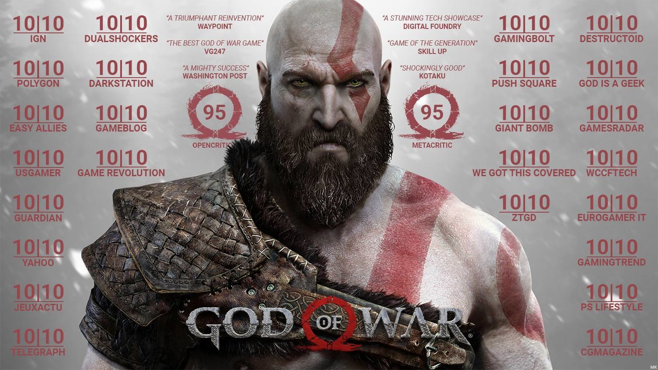
It has been two months since God of War hit the hands and screens of the world - and artists across the studio are now able to share the spectacular work we have been focused on and dedicated to making these last years for this special project. We have all been very gratified with the wide critical acclaim and so many individual people going out of their way to talk about how much they love this game, gushing about not just one but all of its many aspects. I don't know how much time I have spent listening to people talk about it all over youtube, in podcasts, etc - but it feels tremendous for us game developers, who get to experience it seldom (if at all) and are generally sort of invisible behind the scenes. So... thank you! And if you haven't played it yet - what the heck are you waiting for? The image below was out on the internet from just a short time after reviews started hitting, and is only a portion of the scores. 

I've said it before and will again - I believe games have the potential to be one of the most "ultimate" art forms our species has undertaken. They are huge immersive experience-able collections of parts that in their own right are also works of art that stand on their own, which have to interconnect flawlessly. They weave the senses together and present you with new worlds and stories yet manage to also braid your own agency into it. They are truly complex webs of ideas, art, and technology and, while exceptionally varied, have the greatest experience-able potential of things we can create as humans, in my humble opinion. 

The bar constantly rises, the targets constantly shift, more is wanted faster and better than ever before. Costs to do this skyrocket, yet prices never even rise with inflation. Its quite dizzying, exceptionally challenging, potentially devastating, and often thrilling (and stressful). Among all of this - its a titanic amount of work, from lots of disparate individuals, groups, perspectives, and motives. We undertake it because its worth it, because we are creators, because we issue challenges to ourselves on top of those substantial ones that are already out there. We do it because creating is in our DNA, we do it because there is no cresting the horizon of potential and creativity. Just when you think you have, new vistas open up. 

This week we're having our Art Blast, rolled out in phases so that different aspects had a moment in the sun. If you are so inclined, please take some time to explore in more detail all the art we here at Santa Monica Studio have cooked up for you this time. I look forward to topping it. 

Environment Art and Lighting

Character Art, Animation, VFX, Breakables, UI

Concept Art


I'd like to say thank you and give a shout out to a few of my co-workers at SMS who I interacted with most through this project. 

Nate Stephens, thanks for helping to bring things into perspective and providing a great amount of freedom for us to be the artists we would like to be. Your trust is very appreciated. Also, thank you for inviting me to become a part of the studio - I'm glad I chose to come here.

Kevin Quinn, you are a talented hard working artist and I was glad I got to be a part of Tyr's Temple with you. I feel I learned a lot through this project, and I'm sure some of that was via osmosis from being around you and your work. I appreciate your patience and perspective. 

Luke Berliner and Abe Taraky, you guys humored my bubbling enthusiasm when I first joined the studio, and weathered my own little design process in the journey of making the stuff I did. Thanks for the great concepts that are foundational to everything we do, and for humoring me from time to time. 

Vicki Smith, you were patient with me as I stepped out of what should be my area to push things around and try to add and tweak and plus to the end. I gained a fair bit of perspective on game design in general from you while creating Tyr's Vault. It was really great working with you. Your laugh is awesome.

Ruben Morales, you never shied away from aspirations and plans I had for the breakables in the vault. We did the best we could with what we had, and you guys delivered well. Thanks for entertaining my ambitions, and for curbing them into reality as well as doing all the nitty gritty work. Same thanks to you on the hard work Cynthia Fenton-Quijano!

Konstantin Leontyev, I basically hijacked you for help trying to do what is a pretty tall order in a game engine. Thanks for doing your best and for putting hard work into it, especially since it wasn't "on the books" officially. While we weren't able to get all the way there, I still think it ended up adding something special to the space. 

Thom May, thanks for enduring some of my nitpicks while creating the coin tilers and coin stacks. They turned out great, as did the wheel crank. Through long hours and stressful times you were always a cool dude and made others around you laugh. Until we meet again!

Greg Montgomery, Brandon Cha, Chad Orr, and Mario Wiechec - you guys all probably grumbled together often about my many little requests and pushes for certain things in lighting. Thank you to each of you for the passes you did on Tyr's Vault which presented some deceptively tricky issues to solve. 

Lauren Simpson, like above - thanks for enduring some of my never ending (and maybe sometimes unwelcome) ideas and for your work on Tyr's Vault. Take care of that little one!

Kevin Huynh and Max Ancar, thanks for your help as I tried to step in to and take over certain effects with no experience in that. I was glad to learn some new things and hope I was able to produce/modify effects that didn't bring down the average of the work you guys did on this game. 

Dan McKim, thanks for letting me do Kratos' house in your awesome forest level. You are excellent at what you do and I was glad I got to put a tiny flag somewhere in your beautiful level. 

Kyle Bromley, thanks for being my buddy and for almost always beating me at ping pong. You bastard

Enrico Gasperoni, despite being exceptionally busy - you gave an ear to discussions I had to have around systems we had in the game and how to tweak, stretch, and fit all the breakables in for Tyr's Vault. You're a generally cool dude, and damn you can dance well too! 

Enrico Gullotti, your friendly demeanor and strong interest in making things better has been refreshing through the project. Thanks for all the discussions, being open to ideas, and for teaching me some italian. Grazie mille. 


Upward, onward - forward!


~Cliff